Mobile Font: Adding Handwritten Warmth to Editorial Design
There is a specific moment in every editorial design project when the layout feels technically correct but emotionally flat. I experienced this recently while redesigning a seasonal lifestyle guide for a client. The content was rich with personal essays and slow-living photography, yet the initial typography choices felt too sterile for the narrative voice. The grid was perfect, the whitespace was generous, but the publication lacked a heartbeat. It was during this search for visual warmth that I introduced the Mobile font into the layout, and it immediately shifted the tone from polished magazine to intimate journal.
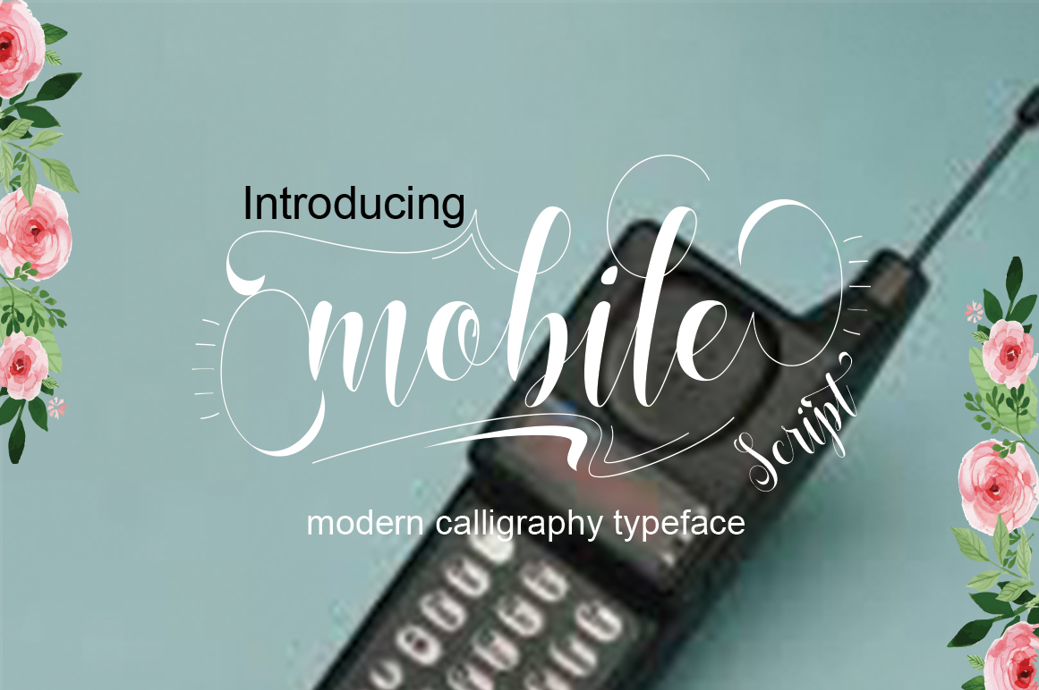
Mobile is not merely a decorative script; it is a handwritten typeface that carries a modern, unique form of calligraphy without sacrificing legibility. In an era where digital content often feels mass-produced, finding a creative font that retains the imperfections and rhythm of human handwriting is essential for building genuine reader connection. As I tested Mobile across various editorial assets, from newsletter headers to printable worksheets, it became clear that this typeface offers a distinct solution for creators seeking to balance aesthetic beauty with functional readability.
Defining Visual Character Through Modern Calligraphy
The first thing you notice when setting text in Mobile is its relaxed cadence. Unlike traditional copperplate scripts that demand formal attention, Mobile flows with a casual confidence. The letterforms possess a natural bounce and varying baseline alignment that mimics authentic penmanship. This organic movement is crucial for editorial design because it prevents the eye from glazing over. When I applied Mobile to the chapter openers of the lifestyle guide, the titles didn't just label the content; they invited the reader to pause and breathe.
This personality makes Mobile particularly effective for brands and publications that rely on trust and intimacy. Whether you are designing a coaching workbook, a wedding planning guide, or a personal blog, the typography must act as an extension of the author’s voice. Mobile succeeds here because it avoids the overly ornate swashes that can clutter small screens or dense layouts. Instead, it offers a refined simplicity that feels premium yet accessible. It bridges the gap between high-end packaging design and approachable web content, making it a versatile asset in any designer's toolkit.
Practical Applications in Digital and Print Layouts
During the redesign project, I utilized Mobile primarily as a display font to establish hierarchy and mood. Its strength lies in short-form applications where character counts are low and impact needs to be high. Here is how the typeface performed across different editorial elements:
- Newsletter Headers: Using Mobile for the subject line graphic and main header created immediate brand recognition in crowded inboxes. The handwritten style signaled personal communication rather than corporate marketing.
- Pull Quotes and Sidebars: Long-form articles benefit from visual breaks. Setting key takeaways in Mobile provided a textural contrast against the body copy, guiding the reader’s eye through the piece without disrupting the reading flow.
- Printable Planners and Worksheets: For PDF downloads intended for home printing, Mobile maintained its integrity at various sizes. The stroke weight is substantial enough to remain crisp on standard office printers, which is a common failure point for thinner script fonts.
- Social Media Graphics: On mobile devices, intricate scripts often become illegible. Mobile’s open counters and distinct letter shapes ensured that quote cards and story overlays remained readable even on smaller screens.
It is important to note where Mobile works best. While it is a beautiful handwritten font, it is not designed for extended body text. Attempting to set paragraphs in any script typeface creates cognitive load and fatigue. Reserve Mobile for titles, subtitles, captions, accents, and signatures. Let your serif or sans serif body fonts handle the heavy lifting of information delivery, allowing Mobile to serve as the emotional anchor of the page.
Strategic Font Pairing for Editorial Balance
A typeface never exists in isolation. The success of Mobile in my layout depended entirely on what I paired it with. Because Mobile has such a distinct, textured personality, it requires a grounding partner. For the lifestyle guide, I paired it with a clean, geometric sans serif for navigation and captions, and a highly readable serif font for the main articles.
This trio created a cohesive visual system. The sans serif provided modern utility, the serif offered traditional authority, and Mobile injected human warmth. When pairing fonts, always look for contrast in structure and mood. If you pair Mobile with another decorative script, the result will be chaotic. If you pair it with a rigid, condensed sans serif, the juxtaposition might feel too harsh. A transitional serif or a rounded sans serif often complements Mobile’s soft edges beautifully. This thoughtful font pairing ensures that the design supports the content rather than competing with it.
Readability Considerations Across Formats
As publishers and bloggers, we must prioritize the reader's experience above pure aesthetics. When testing Mobile for screen reading, I paid close attention to spacing and size. Script fonts generally require more breathing room than block letters. Increasing the tracking slightly and ensuring ample padding around the text prevented the handwritten forms from feeling cramped within the digital container.
For print materials like recipe ebooks or course PDFs, ink spread is a factor. Mobile’s stroke consistency holds up well in print, but it is always wise to test a physical proof before finalizing a large print run. In digital formats, ensure that the font renders correctly across browsers and email clients. While web fonts have improved significantly, some older email platforms may still substitute scripts with fallback fonts. Embedding Mobile as an image for critical headers in newsletters is often safer than relying solely on CSS rendering, ensuring your brand identity remains intact regardless of the recipient's device.
Licensing and Technical Preparation
Before integrating Mobile into commercial projects, thorough technical due diligence is necessary. As a premium font within the Script Amp category, verifying the specific license tier is non-negotiable. Licenses for personal blogs differ vastly from those required for ebooks, paid courses, client work, or merchandise. Always check whether the license covers the number of users, impressions, or products you intend to create.
Additionally, explore the full feature set of the typeface. Many modern handwritten fonts include OpenType features like contextual alternates, ligatures, and swashes that elevate the design. These features allow letters to connect more naturally or add flourishes to capital letters, enhancing the bespoke feel of the layout. Confirming multilingual support is also vital if your publication serves a diverse audience. Finally, organize your design assets by keeping the OTF, TTF, and WOFF2 files clearly labeled and backed up. Proper file management ensures that future updates to your templates or branding remain consistent and efficient.
Choosing the right typeface is an act of empathy toward your reader. It signals that you have considered not just what they will read, but how they will feel while reading it. Mobile offers a rare combination of artistic expression and editorial restraint, making it a valuable tool for creators who want their digital spaces to feel as welcoming as a handwritten note. By applying it thoughtfully within a broader typographic system, you can transform standard content layouts into immersive reading experiences that resonate long after the page is closed.